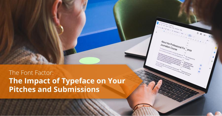
The font is the type style you choose to use to present your work. No matter what program you create your copy in, you will have many dozens to choose from.
You should always stick to one of the plain fonts when sending in copy or emails. Arial, Times New Roman and Calibri are good examples.
Avoid fancy fonts or those that mimic handwriting – they are just hard to read. If you are a commissioning editor, it is irritating to have to convert it to a different, more readable font.
Also, think about the size of your font. We recommend 11 or 12-point font. Anything less is too small and anything bigger just looks a bit daft or like you’re trying to inflate your text.
Finally, don’t overdo italics – many students put quotes in italics, but there is no need to do that. That’s what speech marks were invented for.
It’s important to study the style of a publication before you send in any pitch - if there are any obvious rules the publications seem to apply, make sure you follow them. It will go a long way to demonstrate your attention to detail and build the editor’s confidence in you.


